Helping loan officers know what to do next.
Over the summer, I redesigned Multiply’s internal command center and CRM, working on the tools our loan officers used to manage loans and stay in touch with borrowers. I wanted someone logging in to know what needed their attention and how to get it done.
A main project, and a little bit of everything
I owned the product design for the CRM and command center. Our PM helped set direction, engineering built the designs, and the other designer gave feedback while focusing primarily on our rebrand and marketing work. I worked within an existing design system, but had room to establish new interactions and navigation patterns.
I really enjoyed having one project I could go deep on while also working on whatever came up along the way. If a loan officer got stuck, something needed fixing, or product wanted to add a feature, I got to jump in.
A command center
that grew up
The command center had grown organically. New tools kept getting added, but the navigation was still built around one or two use cases. Each tool had its own layout, and the experience felt fragmented.
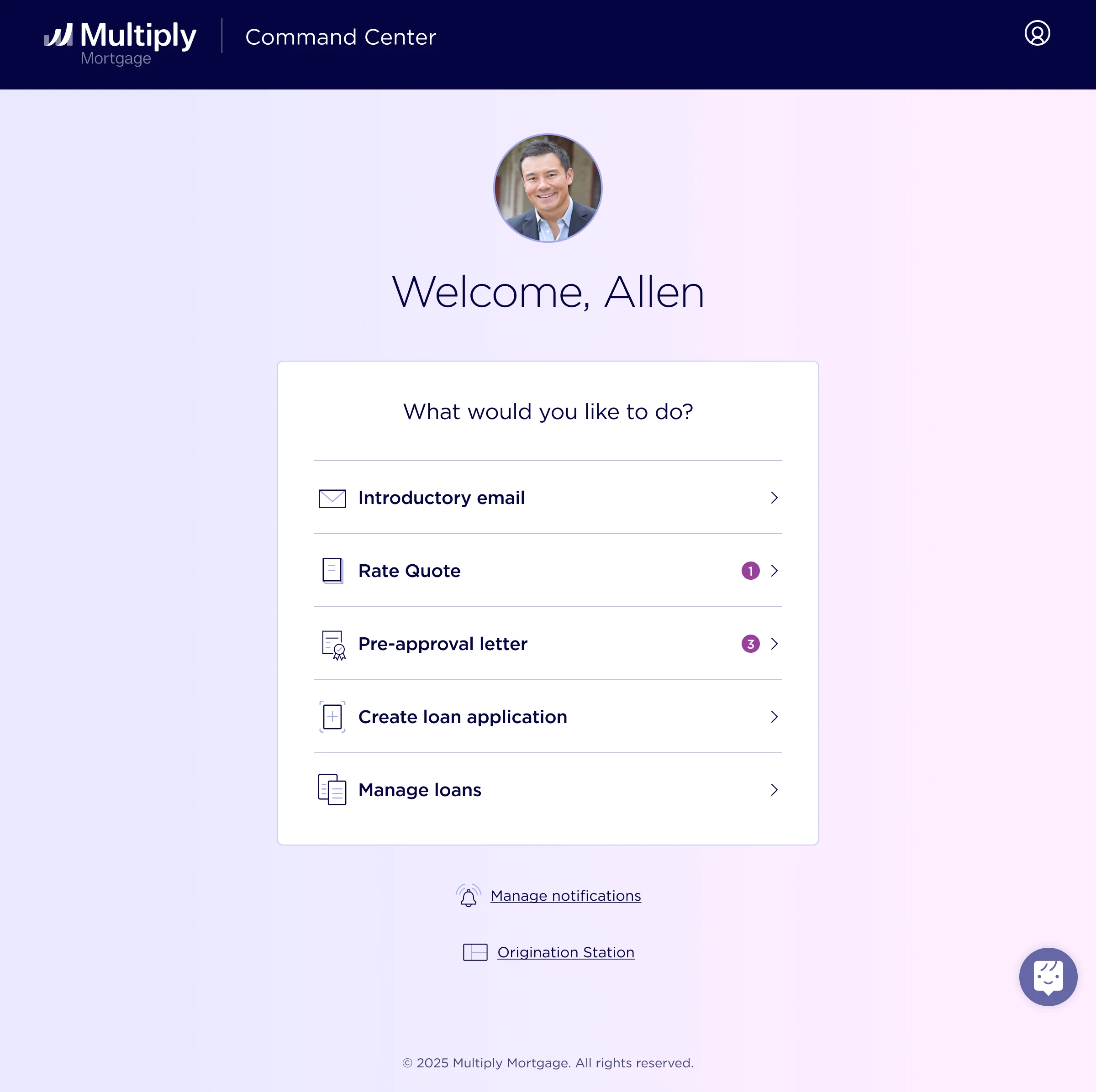
There wasn’t really a dashboard yet—just a starting point with links to different tools. As the product grew, helping loan officers find a feature was only part of the problem. We also needed to help them figure out what to do when they got there.
Before · a list of tools
Understanding how people actually worked
I watched dozens of session replays, looked at usage metrics, and talked individually with loan officers. I first met with them to understand the problems they were running into, then came back with variations and potential directions.
This was especially useful because what a loan officer wanted to do wasn’t always the same as what product wanted to encourage. I had to understand both: make the tool useful in their day-to-day work, while helping drive outcomes like more consistent borrower outreach.
Finding a structure the product could grow into
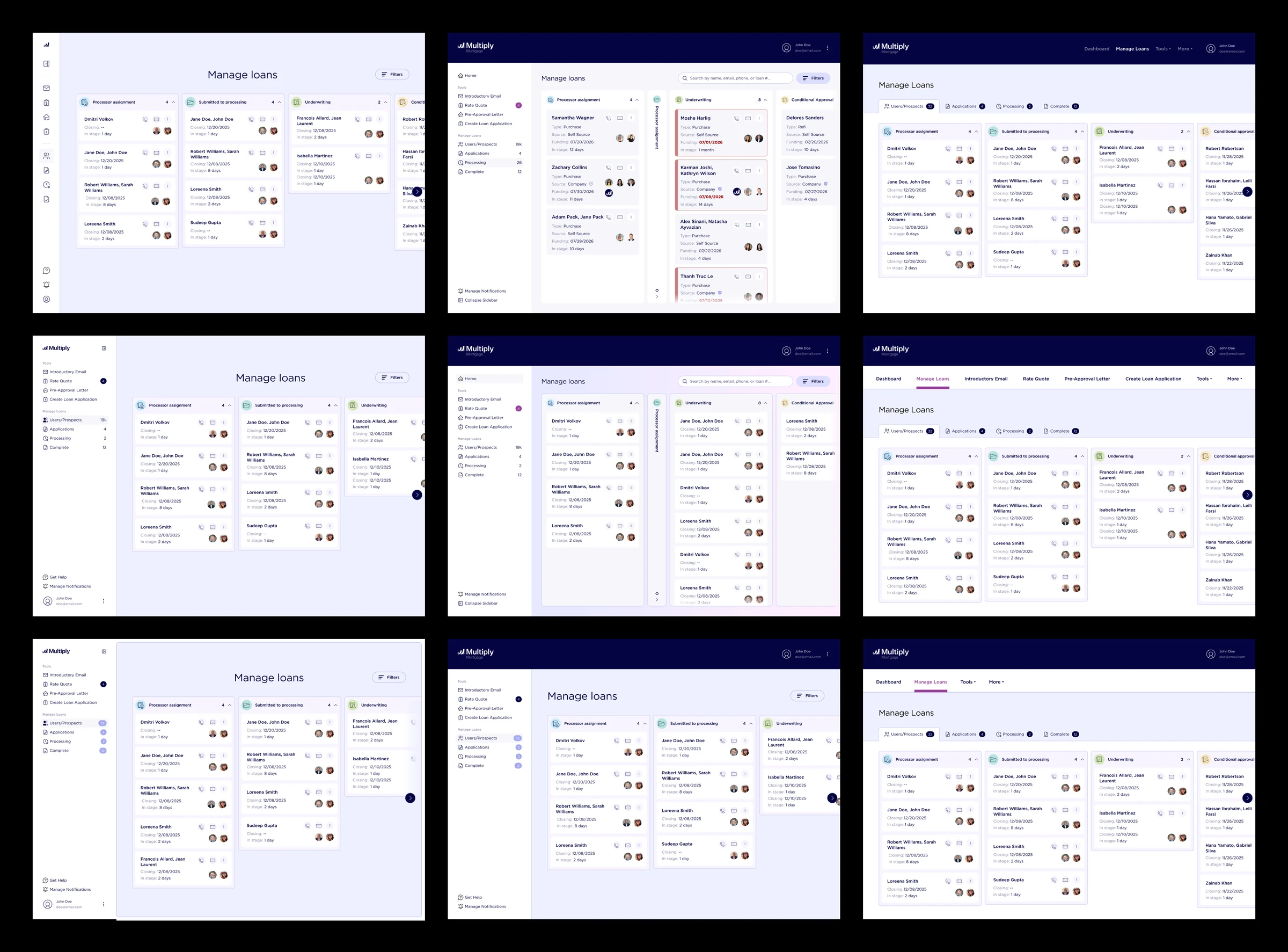
I explored top navigation, sidebars, and combinations of the two. A lot of the work was figuring out a layout and framework that could bring the tools together and still give us room to move things around as the product changed.
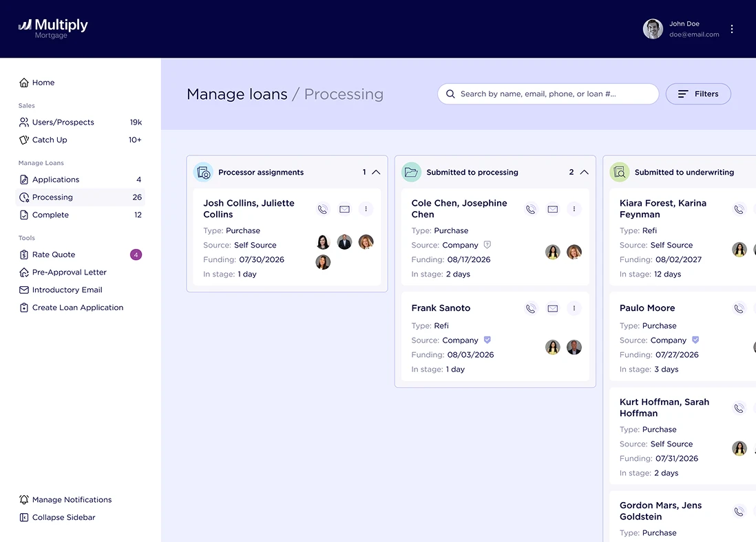
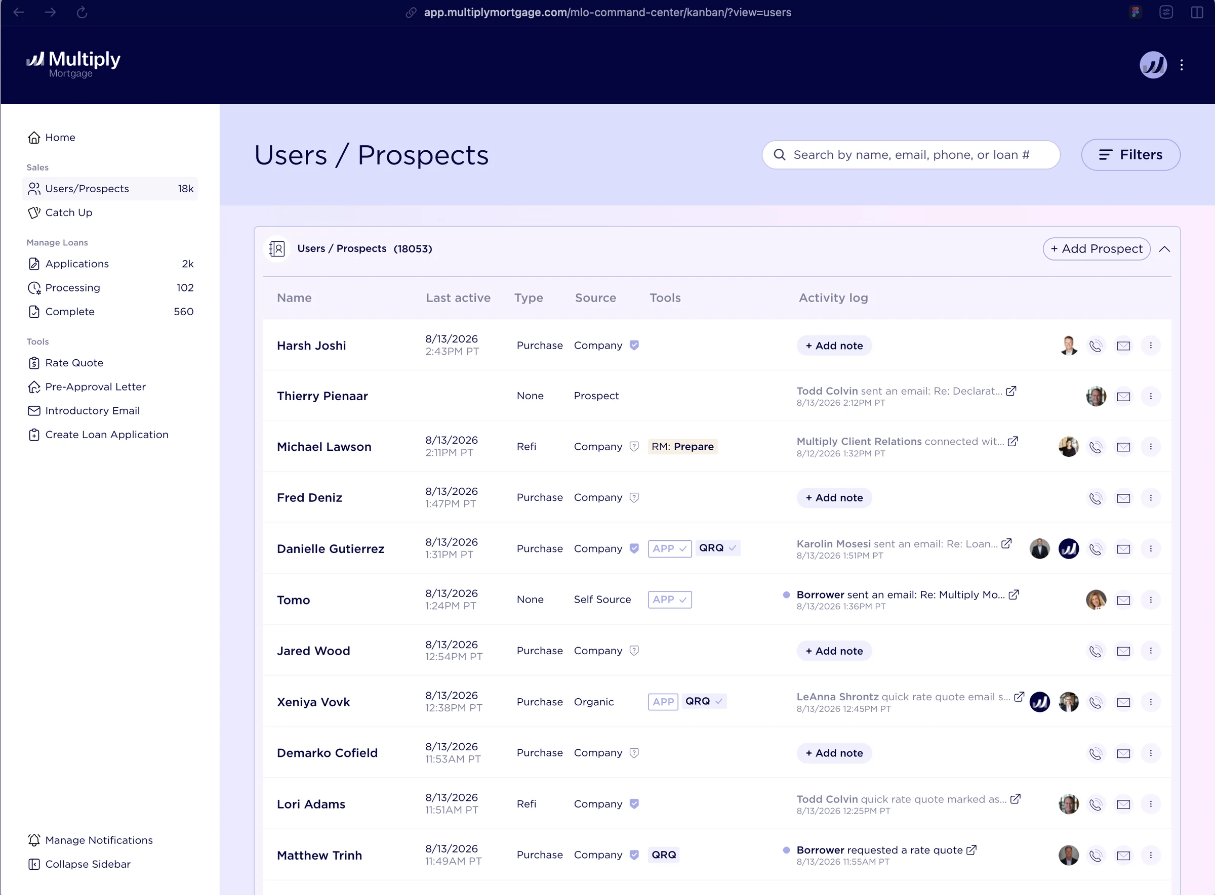
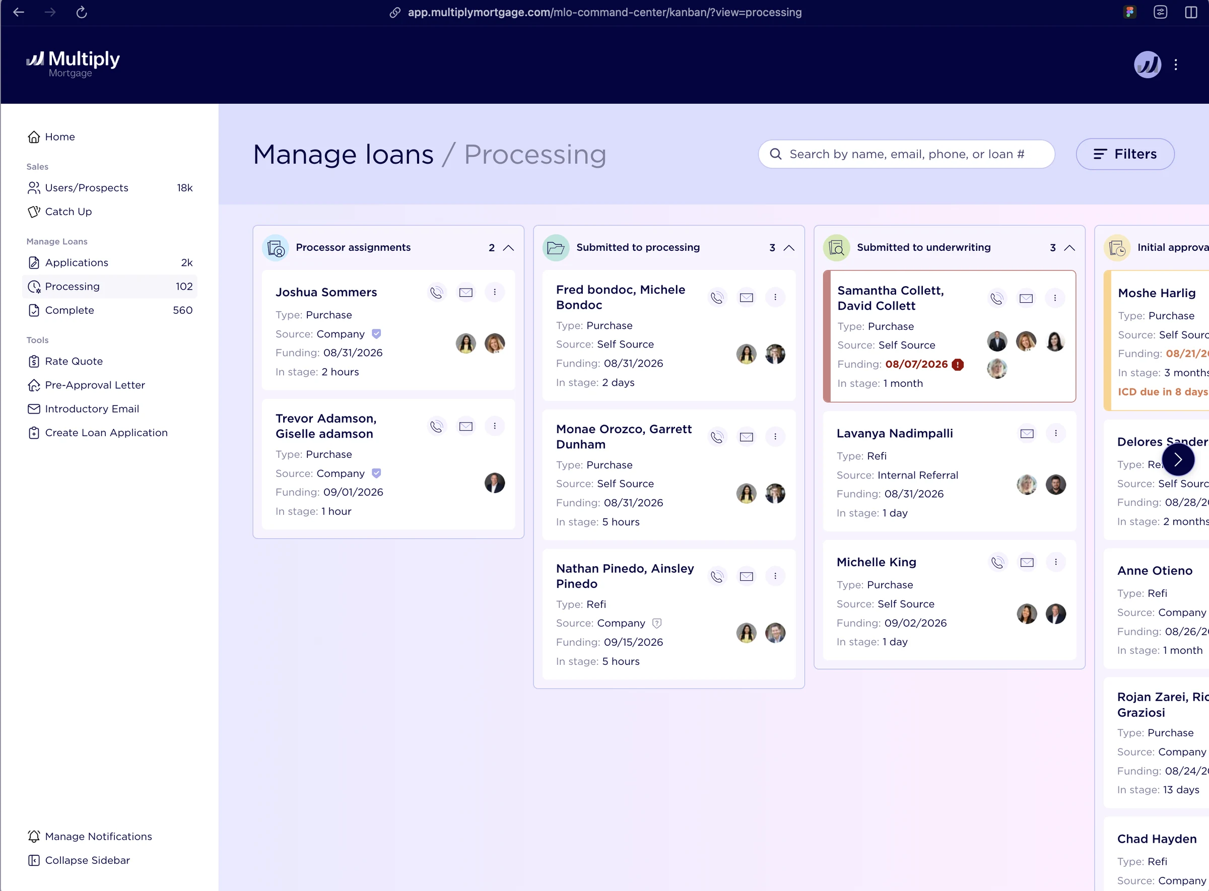
I landed on a mix of top navigation and a sidebar. The sidebar gave the different tools a consistent home, so moving between prospects, applications, and loans felt like working within one product.
Exploration · bringing the tools together
From a starting page to a plan for the day
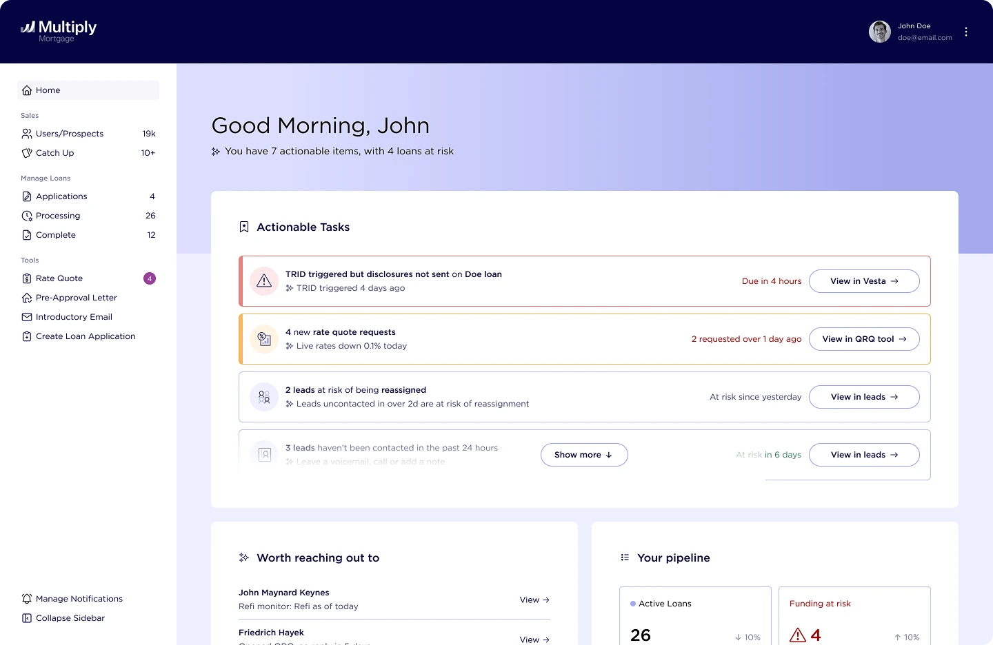
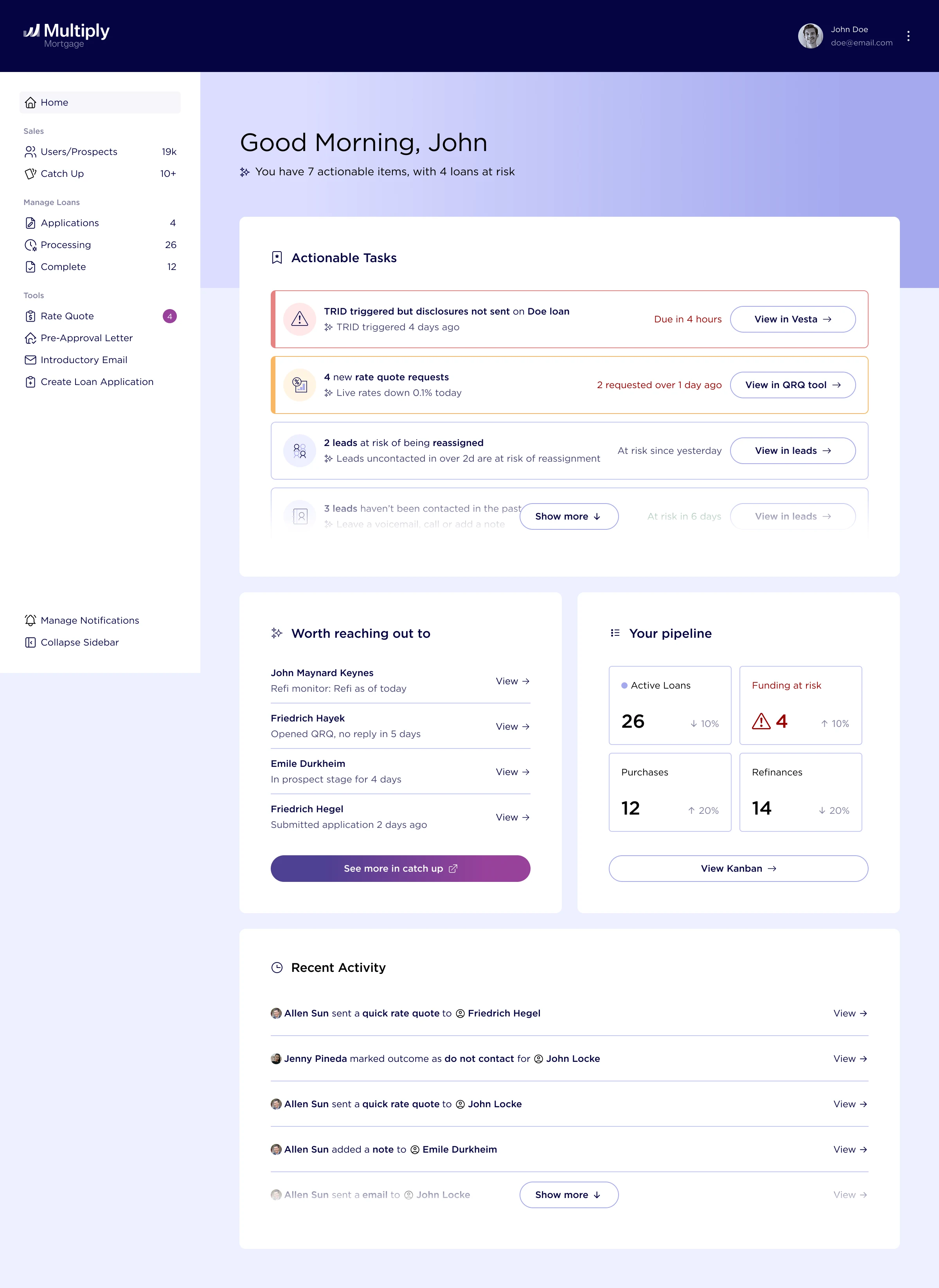
The dashboard became a place to see actionable tasks, borrowers who needed attention, and the status of active loans. Each section connected to the relevant tool or next action.
Working with product and the loan officers helped determine what belonged here. One example was surfacing a borrower who hadn’t been contacted in the past week. That gave the officer a reason to reach out and helped keep people from falling through the cracks.
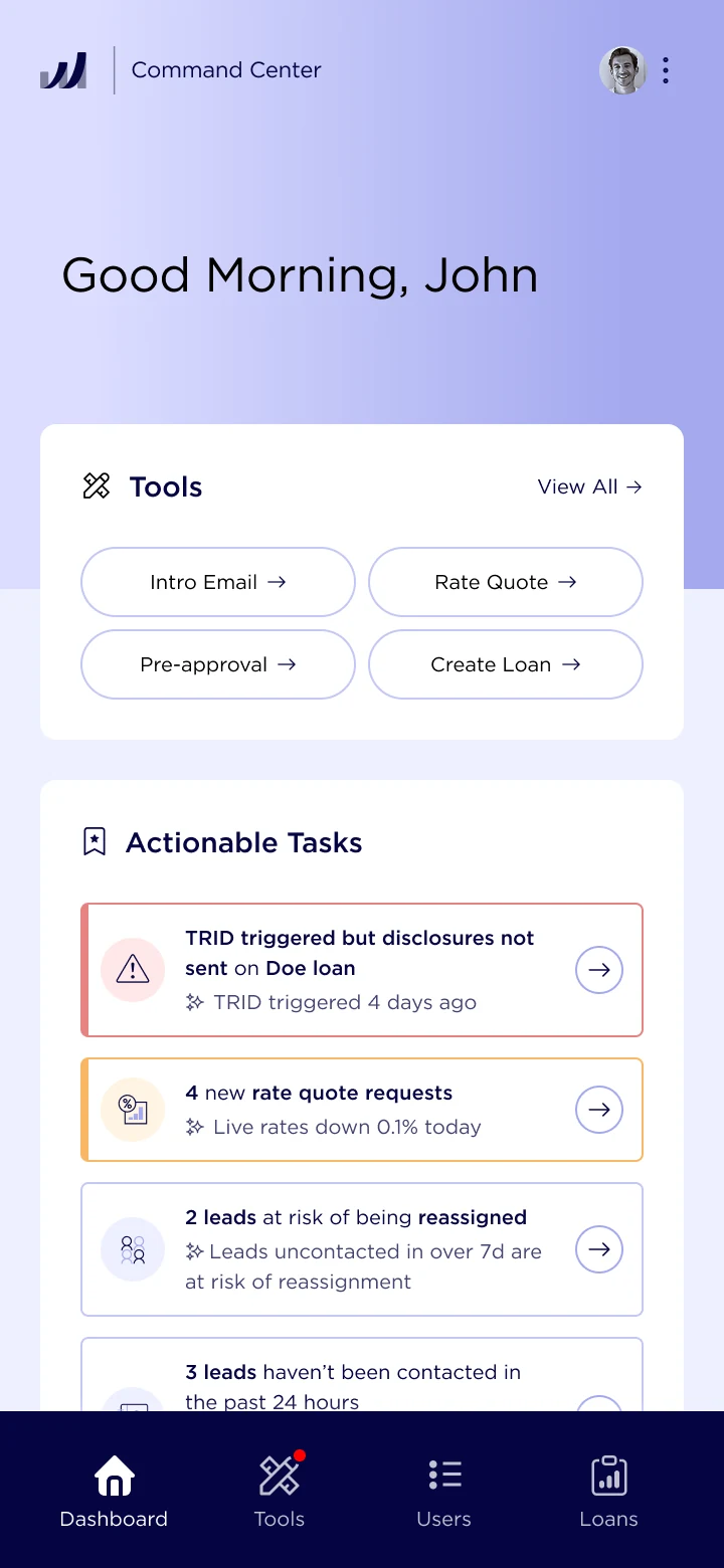
After · a clearer next step
On mobile
Dashboard explorations: add the Figma variations that led to this layout.
Shipping, listening, and going back in
I presented the redesign at Integral, our weekly company-wide all hands, and kept iterating after feedback. One small change was adding names on hover to the collapsed sidebar. With the sidebar open, the labels were obvious; when it collapsed, the icons had to do all the work. The hover labels made it possible to check what each icon meant.
The entire dashboard and navigation redesign shipped, and I had time to keep refining it. Getting to see the work used—and then improve it—was one of the most valuable parts of the summer.
One navigation across tools
Loan pipeline
A short recording or close-up of the collapsed sidebar with a hover label visible.
A shared picture
of each borrower
Multiply already had a basic CRM, but it was fragmented and difficult to use. Notes and marketing emails were there, while conversations between loan officers and borrowers lived in individual inboxes. Usage data also showed gaps: activity wasn’t being logged, and many borrower records had little activity.
This mattered because one borrower could be supported by a team of loan officers, and branch managers sometimes needed to check in too. An individual inbox couldn’t give everyone the same picture of what was happening.
Bringing the conversation into the CRM
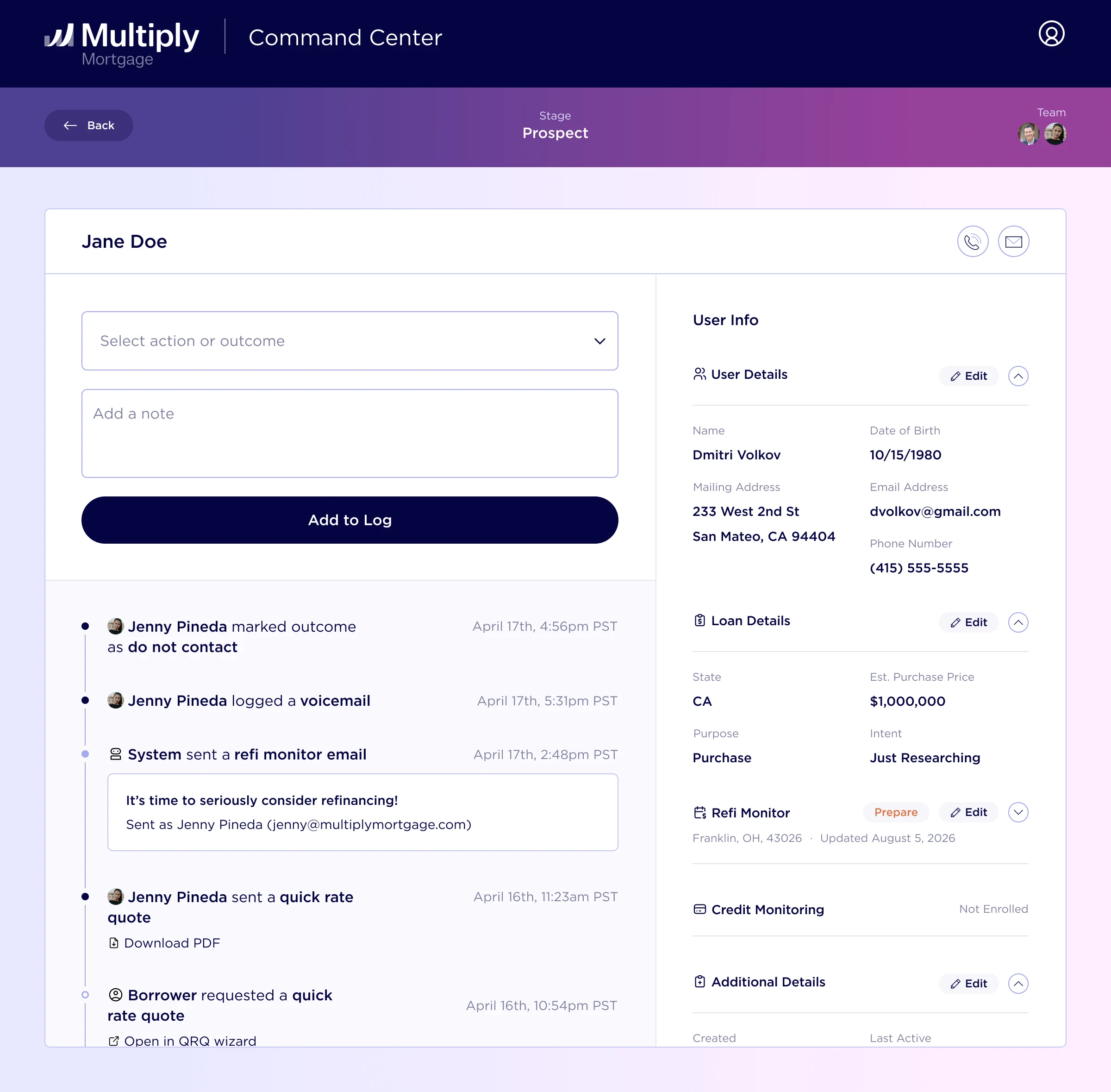
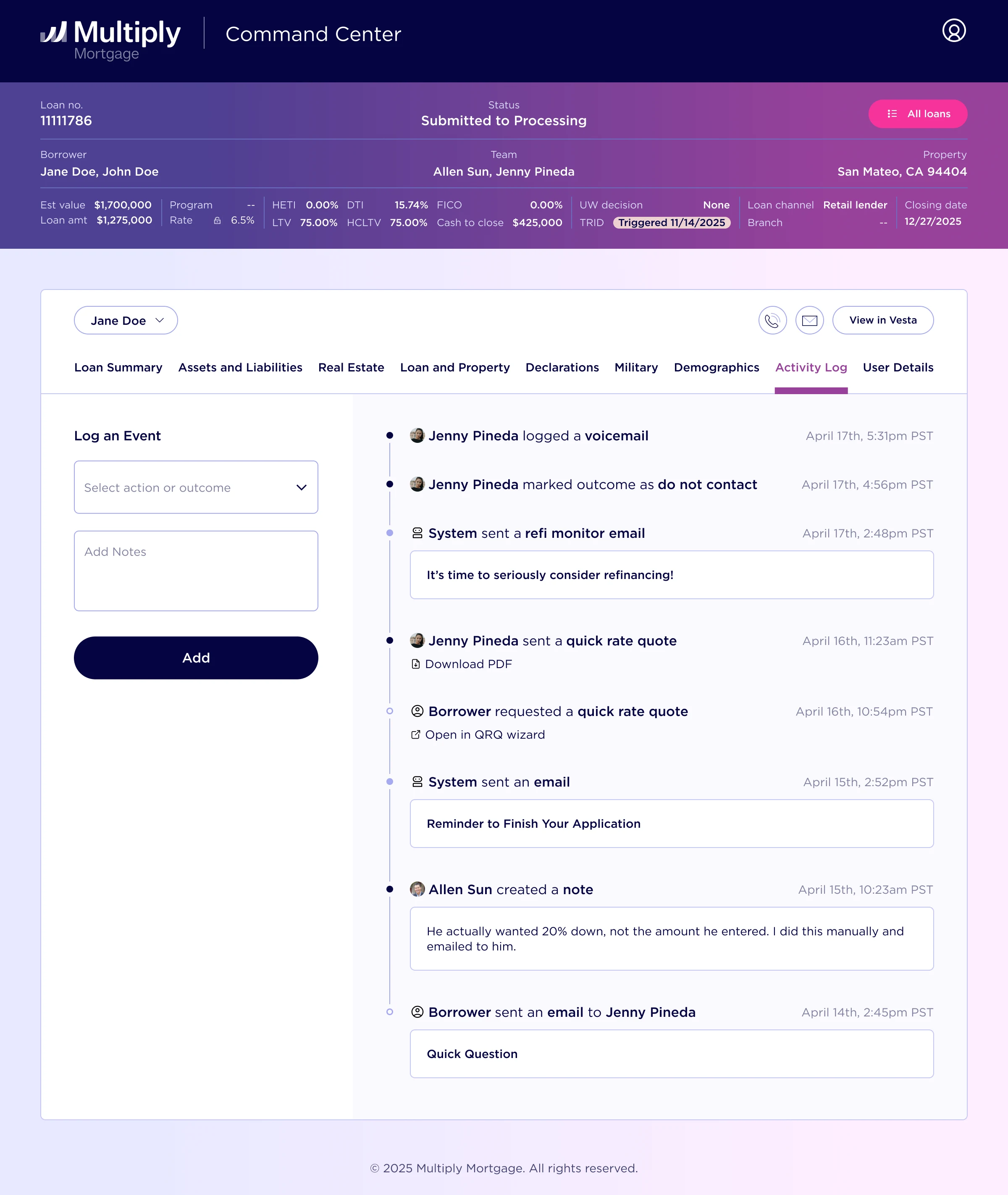
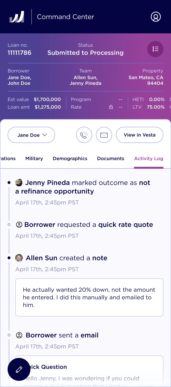
I redesigned the activity log and cleaned up the surrounding experience, bringing loan officer and borrower emails alongside notes and marketing emails. The goal was to give the team one place to understand the relationship and pick up where someone else left off.
Before · the existing activity log
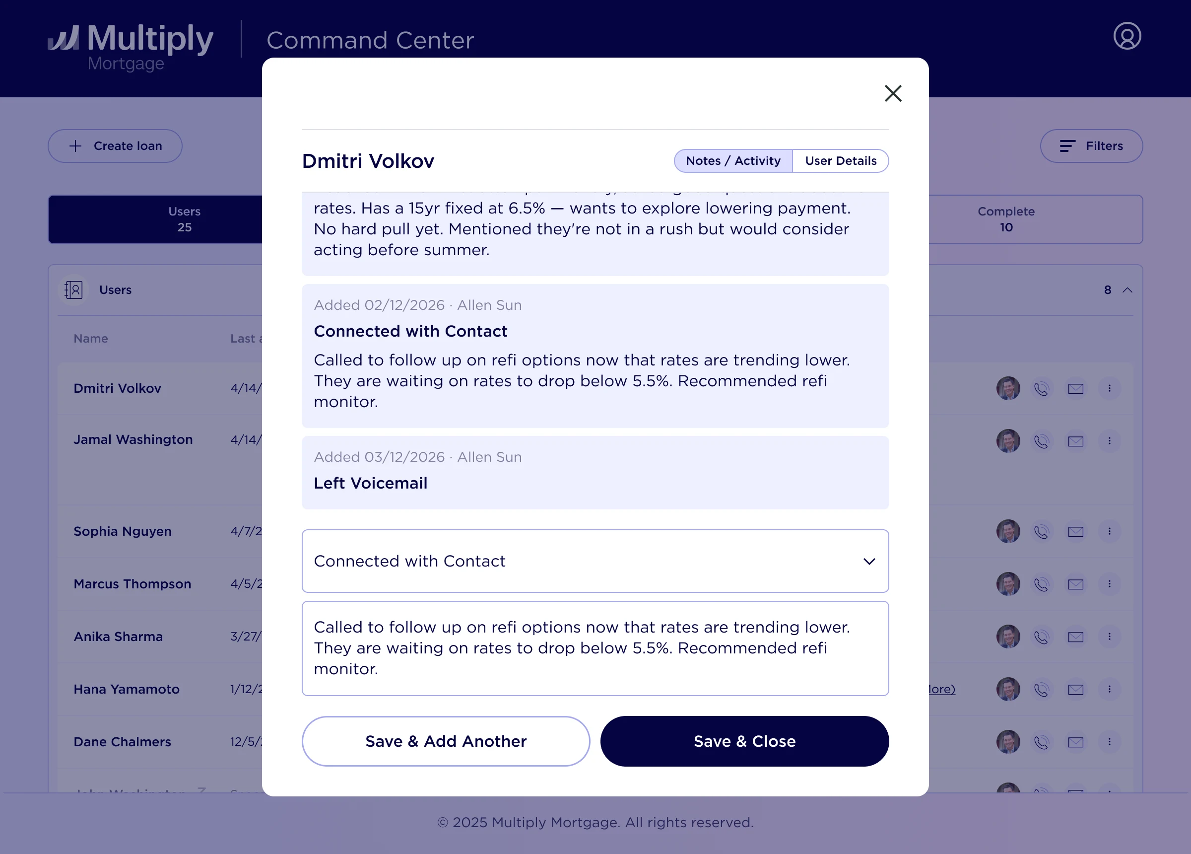
After · more context in one place
Within a loan
On mobile
4×
More contacts with leads
One of the results I’m most proud of was seeing four times as many contacts with leads following the dashboard, navigation, and CRM improvements. The changes made it easier for loan officers to see who needed attention and work through their outreach.
Contacted by a loan officer within 24 hours of signing up or asking a question.
Comparing the week before the redesign with the two weeks after. Contact volume counts loan officers contacting leads; the 24-hour rate measures how promptly leads received a response.
Just as meaningful was hearing directly from the people using it. Paul, one of our loan officers, described how the redesign helped the team manage its pipeline and stay on top of outreach.
“This redesign made navigation extremely smooth, allowing our sales team to manage its pipeline and really dial-in our client outreach cadence and tracking.”
A detour into emails
While working on the product, I took a short break to redesign our emails. We were switching to a more modern email platform during the rebrand, which meant rebuilding emails, workflows, and customer journeys.
I owned the email redesign and came up with several new designs. Then we had another problem: there were dozens of individual emails to implement in code.
Making the next email easier to build
I worked with the marketing team to develop reusable email components and implemented them in code. Then I created a custom Claude skill with instructions for our design system, the components, and how to use them together.
The marketing team could use a simple prompt or a screenshot of a design to create a new email. That gave them a way to keep building with the system after the initial redesign.
Before · reference to confirm

After
The matching redesigned email, ideally with the same content so the changes are easy to compare.
The email workflow: a prompt or design reference, reusable components, and the resulting email.
“Sam built a custom Claude skill that cut the project timeline from several months down to just a few weeks.”
What I’m taking
with me
Designing with the people using it
Being able to talk directly with loan officers, watch how they worked, and come back with something new made the process feel immediate. I got to move quickly, but also go deep. Almost everything I worked on shipped, and hearing that people loved the new experience meant a lot to me.
Learning to hand off, and stay involved
This was my first time working with a full engineering team instead of developing my own designs. I learned to communicate through more detailed Figma wireframes and prototypes, and to think through the states and interactions someone else would need to build.
Having experience building products helped a lot: I could speak the engineers’ language and jump into the codebase during QA to help get the details right. Handoff became another part of the collaboration.
New doesn’t always mean most important
One lesson that stuck with me was recency bias in design. When we’re working on a new feature, it’s easy to want to make it the most visible thing in the product. But stepping back and looking at the whole experience, that isn’t always the right decision. Designing the command center made me think more carefully about where a feature belongs in someone’s actual workflow.
I came away really enjoying this kind of work: owning something substantial, staying close to the people using it, and getting to help with the smaller things that make the whole product better.